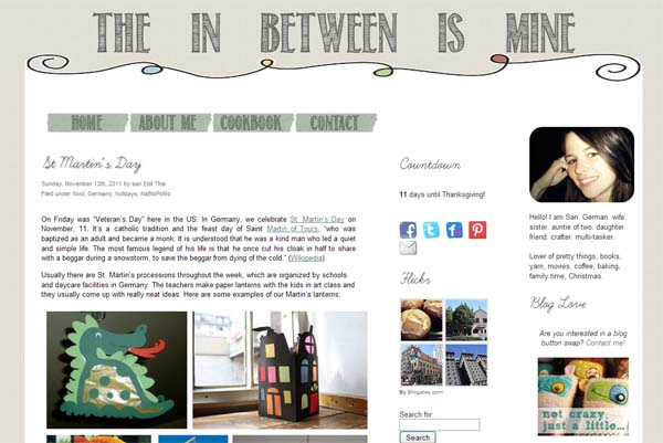
Yes, it’s been a while since I did anything with my blog layout and I thought it was finally time for a little facelift. I am so excited to finally show you what I had been working on for the last few weeks.
There were still some unfinished changes from the last time I announced a makeover, which was over a year ago and so I did not only change the layout, but also worked on my About me – page. Finally.
If you’re reading this in your reader, please click over and check out the new layout.
Since I’ve been fiddling my way through the CSS code all by myself (and I am self-taught and still learning), I’d also really appreciate it if you let me know if you find any glitches or if something is missing. One thing I noticed is that the background color looks different on different computer and browsers. It’s supposed to be “grayish-blue”, but on my laptop it appears to be more of a muted “tea rose”.
As you can see, the changes are not huge – a little bit of extra color and some shuffling around of the sidebars. I also changed the main font, cleaned up the sidebars and managed to move the menu underneath the header. Go me!
I am very excited about the new look!
Let me know what you think!
And as always, thanks so much for taking the time to read and comment here.
I appreciate every single one of you.


Holly
November 14, 2011 at 10:46 amIt looks really good :) I get SO frustrated whenever I play with html/css – even though I used to design websites – that I usually throw in the towel and leave things just as they originally were! (Or hire someone else to do it for me!) Go figure! I’ve always wondered where the title for your blog came from – now I know :)
evi
November 14, 2011 at 10:57 amlove it. great job, sannie !
Lisa
November 14, 2011 at 11:05 amI like it! It looks like a grayish-beige on my monitor. Even if that’s not what you were going for, it is pretty!
Caiti
November 14, 2011 at 11:09 amIt looks really good! I’m impressed with what you did on your own :)
Maribeth
November 14, 2011 at 11:35 amLove the new look!
Nilsa @ SoMi Speaks
November 14, 2011 at 11:38 amI’m way impressed you did this makeover on your own! I’ve always paid someone to do mine … though, I think if I put time into it, I could probably do it on my own, too.
Your header looked “tea rose” on my monitor, too!
I think the only issue I have is that I’m looking at your blog in a completely expanded window and the third column on the right still runs off the page. I wonder if there is some coding that allows your content column (first column) to resize depending on the size of the window, so that third column doesn’t disappear (and force the reader to use the scroll bar at the bottom to see it)?!? Otherwise, great job!
Holly
November 14, 2011 at 11:39 amLooks cute!
Stephany
November 14, 2011 at 11:49 amI love it! I loved your old one, too. It’s really cute!
Suburban Sweetheart
November 14, 2011 at 12:02 pmI love it! I’m with Nilsa, though – I’m looking at it on full-size screen, & it’s too big for the screen. Hmmm. That aside, it looks really great!
steph anne
November 14, 2011 at 12:10 pmCute, you did a great job!! One thing I noticed was that the font for comments and posts are different. I don’t know if that’s something that you did on purpose or not.
Hannah
November 14, 2011 at 1:01 pmi LOVE it! :)
Chrissy
November 14, 2011 at 1:05 pmLove it! great job! and the background is greyish-blue on my monitor!! Hugs xxx
Cathy
November 14, 2011 at 2:34 pmlove the new look – love the about me page – so very you :-)
Just fyi its definatley a light grey colour on both my laptop and PC but both run MS Windows so not sure if that makes a difference. I also run Windows Explorer and not firefly Not sure if that makes a difference either….I also get two lines of header (the inbetween is mine) before I get the Home, About me, Cookbooks, Contact menu options…..I am only saying since you did ask but it looks great :-) you are so clever…. wish I could do stuff like this :-)
talk soon
love ya
Cathy xoxoxo
Manderz
November 14, 2011 at 3:49 pmI like!
katelin
November 14, 2011 at 4:33 pmoh it’s so pretty, i love it!
Vanessa
November 14, 2011 at 6:00 pmEverything looks great!
OhMyLaskmy
November 14, 2011 at 7:18 pmHello, new to your blog but the first thing I said when I clicked on it was “wow, this is pretty”. So job well done. Love it.
Stefanie
November 14, 2011 at 7:38 pmLoving the new look! It feels much cleaner. :)
Melissa
November 14, 2011 at 8:56 pmVery pretty layout!! :) No glitches over here. Well done on the self-taught thing… I wouldn’t be able to do that if my life depended on it, ha!
Megan
November 15, 2011 at 6:35 amI think it looks great! :)
Stephanie@Geezees
November 15, 2011 at 1:15 pmNew to your blog, but i totally dig your layout!
Stina
November 16, 2011 at 11:39 amit looks really cute, great job!
Holly
November 27, 2011 at 4:20 pm(This is suuuuuuper late, sorry!)
You did a wonderful job! Love it! :) I need to learn CSS… haha.