
I’ve been having some pretty intense conversation on Twitter regarding the new Gmail design.
You know, how it is – people are creatures of habit. We don’t do well with change (although change is very often very necessary and, in fact, healthy). When it comes to web mail layout, however, I am a little picky and I like things the way I like them.
I really am all for positive changes, less clutter, a more simplistic, clean design, but I believe that you can also overdo things. The fact that Google decided to overhaul their whole site and give Gmail a “facelift” does not make me happy for many reasons. It might sounds silly, but those changes – even if they don’t seem major at first glance – matter to me.
I am a very visual person. I like to sketch out ideas. I write and re-write lists. I like being organized and orderly. My main job is processing and visualizing 3D data sets, so I thrive off visually appealing and easily understandable results.
This is why I’ll explain my problems with the changes to Gmail.
{Click images for larger version}
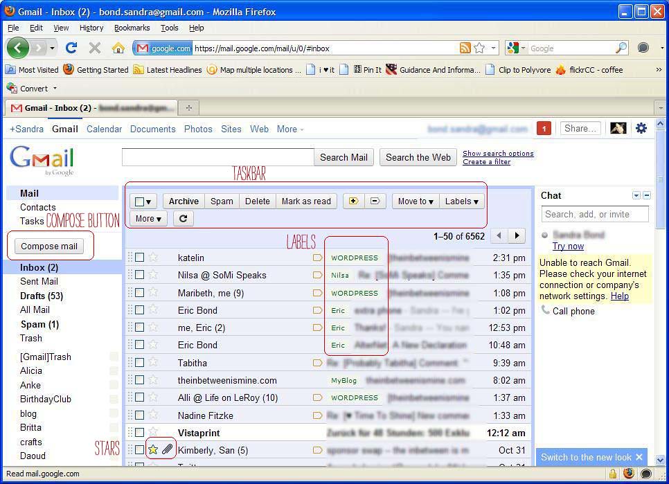
{OLD}
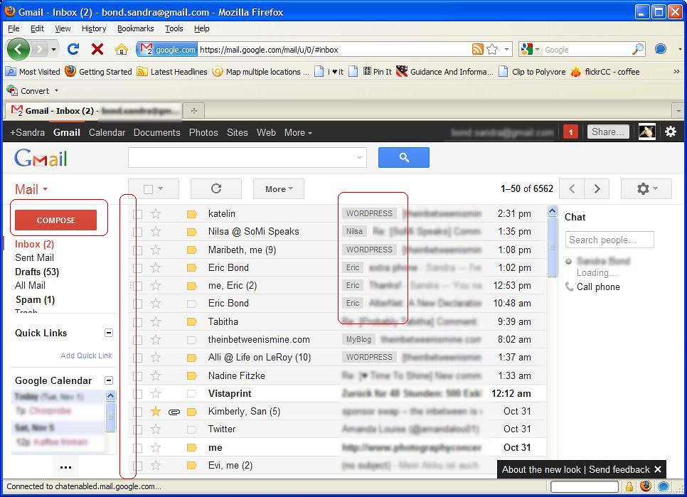
{NEW}
Let’s start with the overall first impression. I really like how in the old layout, the “mailbox” had a clear border and was visually standing out against the rest of the layout. I personally preferred the light blue color (I know you could choose any other color you fancied or even complete themes, which for me personally were always too distracting), but as you can see by the theme I chose: I like it clean and simple. I like soft, but not too soft colors and I like it when colors and layout are harmonious – the orange-red button in the new design makes me cringe.
I am also not necessarily against a lot of “white space”, but… (and here comes my big BUT): when things start blending together in a blur, there is something not quite right. Even a simpler theme in the old version (basic white) still had at least borders which helped dividing up the space.
Just glance at the old and then the new layout and tell me, which gives you a quicker, overall idea of how the page is organized?
For me, it’s much easier to identify the “main mailbox” in the old design, because it has a distinct background color that makes this part of the page “pop” out. In the new design, the borders were eliminated and the light blue background (for read messages) is hardly there.
Next, I am really not digging the black bar at the top of the browser window. Period. In accordance with the light, minimalistic style, a grey bar would have been easier on the eyes.
One thing I really loved in the old version, and which I just realized by comparing the old and new style, was that the “Compose”-button (and all the other buttons, too) had a 3D feel to it. Same goes for the “stars” to mark your emails. In the new design, the 3D effect was swapped for a bold color, but completely “flat” feel. Not a fan.
And then, as you may know, Gmail doesn’t organize mails in folders, but keeps track of emails by assigning labels. Unfortunately, those labels, which are supposed to help with organization, blend in with the mailbox background in the new version instead of popping out (like in the old version).
Now let’s look at the layout for composing a new email.
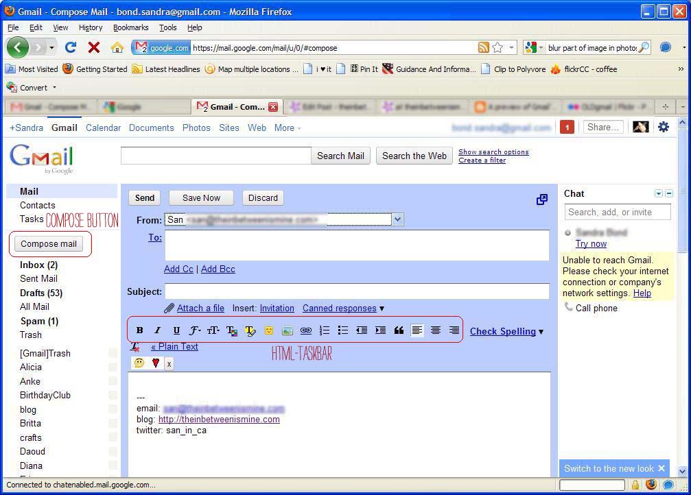
{OLD}
{NEW}
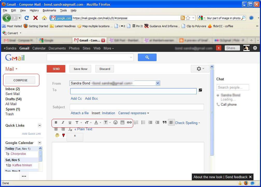
Let’s pay special attention to the HTML-taskbars for a second…
Maybe, you don’t find them all that different, as the new taskbar still shows the same functionalities as the old one. However, visually, I find the old taskbar much more easy to read. The symbols in the new taskbar are a simpler style and all grey, while there is some color-differences int the old one (which I really thought helped navigate).
{OLD)
![]()
{NEW}
![]()
Same goes for the main taskbar — buttons have been swapped for icons (which I personally don’t find so easy to read on first try) and some buttons are hidden behind tiny arrow drop down menus and some only become available, when you read a message or select one in the mailbox view. Also again, I can’t help but point out how I really loved how the buttons seemed to pop out more in the old version.
{OLD}
![]()
{NEW}
![]()
I’ve always been a fan of Google’s conversation view, because it made it easy to follow an email conversation over days or even weeks, because you were able to see them in a stacked view. I really liked the “file”-view in the old layout, which looked like a stack of papers. It made it easy to identify all the participants in the conversation and you could expand each message one by one.
{OLD}
{NEW}
In the new layout the messages are associated with an avatar (which I personally find unnecessary), which also makes the conversation view take up more vertical space. Some of the borders were softened or eliminated which for me personally makes everything blend together more and requires more focused attention. They also got rid of the rounded borders, which I thought to be visually appealing.
And what is it with those tiny, grey arrows?
![]()
I mean, once you know how to find them and what they’re good for, it’s all good, but could they have made those arrows (which replaced a lot of the by one-click accessible buttons) any more ‘invisible’? It seems overall that symbols have become smaller and less distinct.
Finally, one positive change which really is an improvement in design and functionality is the search box, which gives you easy access to all the different search options.

Conclusion after a couple of days of using and comparing (I have two Google accounts and have kept one with the old layout and switched the other to the new layout): Simplifying and optimizing functionality is good and appreciated, but I personally think that Google overdid it a little bit with this overhaul. I thought they had a pretty good thing going as it was.
It seems like many of the changes were more visual (by personal preference) than practical; different, but not necessarily better. I am sure it’ll just take some getting used to and I’ll be fine eventually ;)
What’s your opinion of the new Gmail? Any perks that I haven’t come to appreciate?


Ulli
November 3, 2011 at 6:33 amAlways hated gmail. For realz. I have to go log into mine now to see what it’s like. maybe these changes make me happier..but i doubt it. I just don’t like it.
Maribeth
November 3, 2011 at 6:43 amI’m hating the new Google Reader. Makes me go batty!!!
Lisa
November 3, 2011 at 6:48 amI hate the hidden taskbar buttons. I know it’s for that minimalist look, but it kind of irritates me to have things shifting around.
I also hate that the archive, delete, etc. buttons aren’t at the bottom of messages anymore. Now if I read to the bottom of a message and want to delete it, I have to scroll back up to the top. I know that sounds incredibly whiny, but making your users take extra time and steps to complete a task isn’t a good UI.
kim {notcrazy}
November 3, 2011 at 8:08 amlike i told you yesterday, i already had a really simple theme in the old gmail which looked a lot like the new gmail does now. i like it and don’t think it’s that much more difficult to use…
if you go to your mail settings and chose a color theme (blue for example) you will have a bigger contrast between the inbox and the rest. maybe that’ll help a bit :)
san
November 3, 2011 at 3:15 pmThat’s my point: It should not be “not much more difficult to use”, it should be EASIER.
kim {notcrazy}
November 3, 2011 at 8:09 amps. that will also make the red “compose” button go away ;) i’m actually using the “soft grey” – THAT’s how simple i like it :)
kim {notcrazy}
November 3, 2011 at 8:12 ampps. if you hover over the labels in the menu on the left sidebar, you will see a little grey box with an arrow in it. click on that and you can give your labels different colors. those will show up in that (soft) color in your inbox, too and make it easier to tell apart what message has what label :)
Nilsa @ SoMi Speaks
November 3, 2011 at 8:52 amWell, I didn’t put quite as much thought into it as you. My initial thought was that the simpler design will be less obvious to people at work that I have a Google page up on my browser. And, yeah, I agree that any change takes getting used to. But, I don’t harbor any deep seeded hate for the new design at all. I’ll get used to it in a week or so and that will be that.
Suburban Sweetheart
November 3, 2011 at 1:38 pmA really good overview, San! Personally, I find the new overhaul to be somewhat exhausting. As you said, everything blends together – and nowhere do I feel more frustrated by this than in Google Reader.
Stephany
November 3, 2011 at 3:19 pmWow, you put a lot of work into this post!
I really, really like the new gmail, I must say. I don’t feel that things blend together at all and I think a different theme might help for you, if things seem to blend too much. I like the minimalistic nature of it, how easy it is on the eyes. I haven’t had one complaint.
I also don’t hate the new Reader, although I will admit that I liked the old one better. It’s hard to find things, but I think that just takes some getting used to.
I guess I’m just indifferent to it all. In the grand scheme of life, a change to my gmail or Reader, even though I use both a lot, isn’t going to make me super upset or sign petitions or anything. It’s just something to get used to.
katelin
November 3, 2011 at 3:26 pmi haven’t switched over yet, i’m a little worried. i don’t work well with tech changes either, haha.
whitney
November 3, 2011 at 4:41 pmI think you have some valid points! It’s a drastic change. I’m not having too many issues with gmail, but don’t get me started on google reader! Why does the scroll bar have to disappear! Ugh!
mandy
November 3, 2011 at 6:12 pmI’m not a fan and am resisting all changes until I am forced to make the switch. great post!
Susanne
November 3, 2011 at 7:53 pmI love my gmail. But I still have the old design. I did not even know there is a new one until I read your post! Does it asked me somewhere to change it??
Susanne
November 3, 2011 at 8:43 pm*ask
Manderz
November 3, 2011 at 8:45 pmI do 99% of my Gmailing from my phone, so I honestly didn`t even notice most of the changes you pointed out until reading this. It`ll take me a little bit longer to do some tasks until I get used to it, but for the most part I just accept tech changes and move on.
Unless it`s a new program at work, in which case I thrive on pointing out all the changes that should not have occurred.
lauryn
November 4, 2011 at 6:33 amI already switched back to the old gmail layout. I can’t even get the page to scroll up and down properly on my work computer. It’s incredibly annoying! Hopefully they fix it soon…
Melissa
November 4, 2011 at 9:48 amOh, I don’t like the new Gmail at all. I was wondering how I hadn’t noticed the change in my OWN account… til I opened it a second ago and realized I’m still using the old format. I think I’m going to keep it- I hope they don’t MAKE me switch? But I guess I’ll get used to it if I have to!
steph anne
November 4, 2011 at 11:15 amI totally agree with all of your points about it. I notice that you can change the size of the emails to Comfortable, Cozy, or Compact. I didn’t like Comfortable or Cozy so I have it on Compact since it looks similar to the old Gmail.
Chrissy
November 4, 2011 at 1:35 pmI haven’t switched, yet! Maybe I will even wait longer now! haha
Awesome post!
Irene
November 4, 2011 at 3:57 pmwow…you really do pay attention to detail *laugh*… I am just glad I use Outlook for my emails….no worries about any old or new designs :)
Kat
November 6, 2011 at 7:01 amUgh, I kind of forgot to actually comment on this after our exchange on Twitter… ;) I agree with everything you said – except for the black bar at the top. I actually love the new Google design in general (for maps, translate, search, etc.) (and the black bar reminds me of the bar that WordPress adds to your site when you’re logged in, except it bugs me *more* with WP)… but I do agree that most everything has become less practical. They’re just changes in design, not improvements. That being said, a week or so into the new design, I’m already used to it now. I still think it’s crappy in terms of user-friendliness but it doesn’t make me sigh heavily anymore everytime I write an email. ;)
terra
November 7, 2011 at 4:54 pmAfter living it with for the past week I still don’t like it. I wish they’d rolled out changes bit by bit instead of doing a full overworking of the interface. After a week, it’s still really hard for me to figure out where the buttons I need are.